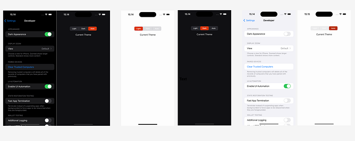
Theme can be set manually or automatically.

In iOS development, creating a user interface that adapts to different themes (Light, Dark, Auto) can enhance user experience. This article demonstrates how to implement a dynamic theme selector using UIKit, SnapKit for layout, and custom UIColor extensions for theme management.
We will build a simple UIViewController with a segmented control that allows users to switch between Light, Dark, and Auto themes. We’ll also handle dynamic color changes based on the selected theme and system appearance using SnapKit for constraints.
Implementation
1. UIColor Extension for Dynamic Theming
To support dynamic theming, we extend UIColor to handle color changes based on the selected theme and system appearance:
// MARK: UIColor Extensions for Theming

extension UIColor {
    static var blackBackground: UIColor { UIColor.hex(light: "FDFDFD", dark: "101013") }
    static var textColor: UIColor { UIColor.hex(light: "0D0D0D", dark: "FDFDFD") }
    static var selectionColor: UIColor { UIColor.hex(light: "B9300E", dark: "DE350B") }
}

// MARK: Hex Color and Theme Management

extension UIColor {
    convenience init(hexString: String) {
        let hex = hexString.trimmingCharacters(in: CharacterSet.alphanumerics.inverted)
        var int = UInt64()
        Scanner(string: hex).scanHexInt64(&int)
        let a, r, g, b: UInt64
        switch hex.count {
        case 3: // RGB (12-bit)
            (a, r, g, b) = (255, (int >> 8) * 17, (int >> 4 & 0xF) * 17, (int & 0xF) * 17)
        case 6: // RGB (24-bit)
            (a, r, g, b) = (255, int >> 16, int >> 8 & 0xFF, int & 0xFF)
        case 8: // ARGB (32-bit)
            (a, r, g, b) = (int >> 24, int >> 16 & 0xFF, int >> 8 & 0xFF, int & 0xFF)
        default:
            (a, r, g, b) = (255, 0, 0, 0)
        }
        self.init(red: CGFloat(r) / 255, green: CGFloat(g) / 255, blue: CGFloat(b) / 255, alpha: CGFloat(a) / 255)
    }

    static func hex(_ hexString: String) -> UIColor {
        UIColor(hexString: hexString)
    }

    static func hex(light lightHex: String, dark darkHex: String?) -> UIColor {
        let lightColor = UIColor.hex(lightHex)

        return UIColor { traitCollection -> UIColor in
            let colorTheme = UserDefaults.standard.integer(forKey: DataConstant.SETTING_THEME_COLOR)
            if colorTheme == 1, let darkHex = darkHex {
                return UIColor.hex(darkHex)
            } else if colorTheme == 2 {
                if let darkHex = darkHex, traitCollection.userInterfaceStyle == .dark {
                    return UIColor.hex(darkHex)
                } else {
                    return lightColor
                }
            } else {
                return lightColor
            }
        }
    }
}
2. Setup UserDefaults
// MARK: Constant for Theme Settings

enum DataConstant {
    static let SETTING_THEME_COLOR = "SETTING_THEME_COLOR"
}
3. Setting Up the ViewController
import SnapKit
import UIKit

class AutoThemeColorController: UIViewController {
    private let themeSegmentedControl = UISegmentedControl(items: ["Light", "Dark", "Auto"])
    private let themeLabel: UILabel = {
        let label = UILabel()
        label.text = "Current Theme"
        label.textAlignment = .center
        return label
    }()

    override func viewDidLoad() {
        super.viewDidLoad()
        setupConstraints()
        applyCurrentTheme()

        themeSegmentedControl.addTarget(self, action: #selector(themeChanged(_:)), for: .valueChanged)
        themeSegmentedControl.selectedSegmentTintColor = .selectionColor

        let textAttributes = [
            NSAttributedString.Key.foregroundColor: UIColor.white
        ]
        themeSegmentedControl.setTitleTextAttributes(textAttributes, for: .normal)

        let themeIndex = UserDefaults.standard.integer(forKey: DataConstant.SETTING_THEME_COLOR)
        themeSegmentedControl.selectedSegmentIndex = themeIndex
    }

    private func setupConstraints() {
        view.addSubview(themeSegmentedControl)
        view.addSubview(themeLabel)

        themeSegmentedControl.snp.makeConstraints { make in
            make.centerX.equalToSuperview()
            make.top.equalTo(view.safeAreaLayoutGuide.snp.top).offset(20)
            make.width.equalTo(200)
        }

        themeLabel.snp.makeConstraints { make in
            make.centerX.equalToSuperview()
            make.top.equalTo(themeSegmentedControl.snp.bottom).offset(20)
        }
    }

    @objc private func themeChanged(_ sender: UISegmentedControl) {
        UserDefaults.standard.set(sender.selectedSegmentIndex, forKey: DataConstant.SETTING_THEME_COLOR)
        applyCurrentTheme()
    }

    private func applyCurrentTheme() {
        view.backgroundColor = .blackBackground
        themeLabel.textColor = .textColor
    }

    override func traitCollectionDidChange(_ previousTraitCollection: UITraitCollection?) {
        super.traitCollectionDidChange(previousTraitCollection)
        if previousTraitCollection?.userInterfaceStyle != traitCollection.userInterfaceStyle {
            applyCurrentTheme()
        }
    }
}
By following this guide, you can create a responsive theme-switching feature in your iOS application that adapts to user preferences and system appearance changes.
Transform Your Ideas into Reality with Expert iOS & Flutter Development! 🚀 Are you looking to bring your app concept to life? I specialize in crafting exceptional iOS and Flutter applications that stand out in the digital world. Let’s collaborate to turn your vision into a stunning, functional app. Contact me today to start your app development journey!”
